Fashion advice about age can be controversial, and for good reason. The truth is that there is no color that becomes completely off-limits once you turn 50. Personal style, skin tone, hair color, confidence, and occasion matter far more than a number on a birthday cake. Many women and men over 50 wear bold, vibrant colors beautifully.
However, some colors can be less flattering as our features naturally change over time. Skin tone may become softer, hair may turn gray or silver, and facial contrast often decreases. Certain shades can unintentionally make the complexion look tired, washed out, or overly harsh. The key is not avoiding color altogether—it’s choosing the right version of a color and wearing it strategically.
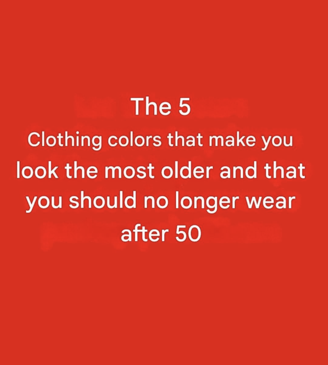
Here are five colors that can sometimes be challenging after 50, along with flattering alternatives that can help you look refreshed, vibrant, and polished.
Understanding Why Colors Matter More With Age
As we age, several things naturally happen:
- Skin may lose some of its natural pigmentation.
- Fine lines and texture become more noticeable.
- Hair often turns gray, silver, white, or lighter.
- The contrast between hair, skin, and eyes can decrease.
Because of these changes, colors that once looked fantastic may suddenly seem less flattering. This doesn’t mean your style has to become boring. In fact, many people find they can wear a wider variety of sophisticated shades after 50 than they could when they were younger.
The goal is not to look younger. The goal is to look healthy, energized, and confident.
Color #1: Harsh Black
Why It Can Be Problematic
Black is often considered universally flattering, but that’s not always true.
As skin tone softens with age, a stark black garment worn close to the face can create strong contrast that may:
- Emphasize shadows under the eyes
- Highlight fine lines
- Make skin appear paler
- Draw attention to discoloration
For someone with silver, gray, or white hair, pure black can sometimes feel overly severe.
What to Wear Instead
Charcoal Gray
Charcoal provides sophistication without the harshness of jet black.
Benefits include:
- Softer appearance
- Elegant and timeless
- Easy to pair with other colors
Navy Blue
Navy is one of the most universally flattering colors.
It offers:
- Depth
- Refinement
- Better harmony with mature complexions
Soft Espresso Brown
A deep brown can be just as versatile as black while appearing warmer and friendlier.
Color #2: Neon Shades
Why They Can Be Challenging
Neon colors became popular in various fashion eras and continue to appear in trends.
Examples include:
- Neon green
- Electric pink
- Fluorescent yellow
- Bright orange
These colors are highly saturated and tend to dominate the face rather than complement it.
They may:
- Overwhelm natural features
- Create visual imbalance
- Distract from your face
What to Wear Instead
Jewel Tones
Jewel tones offer richness without excessive intensity.
Examples:
- Emerald green
- Sapphire blue
- Ruby red
- Amethyst purple
These colors feel luxurious and sophisticated.
Rich Coral
Coral brings energy while remaining flattering and wearable.
Deep Teal
Teal combines blue and green in a balanced way that works beautifully on many mature skin tones.
Color #3: Beige That Matches Your Skin Too Closely
Why It Can Be Problematic
Many people assume beige is safe because it is neutral.
However, if beige closely matches your skin tone, it can create a washed-out effect.
The result may be:
- Lack of definition
- Tired appearance
- Diminished facial contrast
This is especially noticeable in tops, scarves, and jackets worn near the face.
What to Wear Instead
Warm Camel
Camel offers more depth and richness.
Soft Taupe
Taupe provides sophistication while maintaining contrast.
Cream or Ivory
These shades often brighten the complexion more effectively than flat beige.
Color #4: Very Pale Pastels
Why They Can Be Difficult
Pastels can be beautiful, but extremely pale versions sometimes create challenges.
Examples:
- Powder pink
- Baby blue
- Pale lavender
- Light mint
When combined with gray hair and lighter skin tones, very pale colors may make features disappear rather than stand out.
What to Wear Instead
Dusty Rose
A deeper pink adds warmth and life.
Periwinkle Blue
More vibrant than baby blue but still soft.
Soft Plum
Provides depth while remaining feminine and elegant.
Sage Green
A sophisticated alternative to mint.
Color #5: Mustard Yellow Near the Face
Why It Can Be Tricky
Mustard yellow can be fashionable, but it doesn’t flatter everyone.
Depending on skin undertones, it may:
- Emphasize sallowness
- Highlight redness
- Make the complexion appear dull
This is especially true when worn as a top, scarf, or jacket near the face.
What to Wear Instead
Golden Honey
Warmer and softer than mustard.
Soft Marigold
Brighter and more uplifting.
Warm Peach
Adds healthy-looking warmth to many complexions.
Terracotta
Rich, earthy, and flattering on a wide range of skin tones.
The Colors That Often Look Amazing After 50
Rather than focusing only on what to avoid, it helps to know which colors frequently shine.
Navy
Sophisticated and versatile.
Emerald Green
Elegant and energizing.
Burgundy
Rich without being overwhelming.
Teal
Works on many skin tones.
Plum
Adds depth and refinement.
Coral
Brightens the face naturally.
Ivory
Softer and often more flattering than pure white.
Soft Gray
Modern and polished.
How Hair Color Changes the Equation
Hair color plays a major role in how colors appear.
Silver Hair
Looks stunning with:
- Navy
- Emerald
- Plum
- Raspberry
- Teal
White Hair
Pairs beautifully with:
- Jewel tones
- Bright blues
- Rich reds
Gray Hair
Often benefits from:
- Cool-toned colors
- Sophisticated neutrals
- Deep but not harsh shades
The Importance of Skin Undertones
Two people can wear the exact same color and have completely different results.
Warm Undertones
Often look great in:
- Coral
- Terracotta
- Camel
- Olive green
Cool Undertones
Often shine in:
- Sapphire blue
- Plum
- Raspberry
- Cool gray
Neutral Undertones
Usually have the most flexibility.
Accessories Can Make Any Color Work
Even if a color isn’t your most flattering shade, accessories can help.
For example:
- Add a colorful scarf between your face and a dark top.
- Wear statement jewelry to create visual interest.
- Use makeup strategically to add warmth and definition.
- Pair challenging colors with more flattering shades.
Fashion is about balance, not rigid rules.
Confidence Is More Important Than Color Rules
Perhaps the most important point is this:
No article, stylist, or fashion expert can determine what you “must” wear after a certain age.
Many women and men over 50 look incredible in black, bright colors, pastels, and even shades that conventional wisdom says they should avoid. Personal style is deeply individual.
The most flattering color is often the one that makes you:
- Feel confident
- Stand taller
- Smile more
- Express your personality
When a color makes you feel good, that confidence becomes part of the outfit.