The Hidden Story Behind One of the Most “Confusing” Design Details in the Kitchen
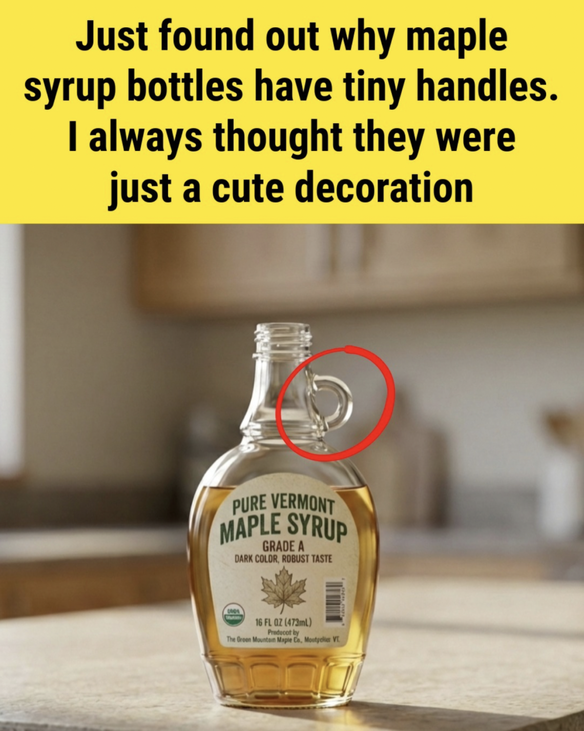
At first glance, the tiny handle on a maple syrup bottle feels like a design mistake.
It’s too small to comfortably fit a finger.
Too delicate to be a real grip.
And in most cases, you end up holding the bottle by the body anyway.
So the obvious question appears:
Why is it even there?
But this small detail actually carries a long history of practical design, food culture, manufacturing evolution, and even marketing psychology. What looks “useless” today was once quite functional—and still serves subtle purposes now.
To understand it properly, you have to go back to how maple syrup was originally stored, sold, and used.
1. Maple Syrup Was Once a Heavy, Bulky Product
Long before modern squeeze bottles and lightweight packaging, maple syrup was sold in:
- thick glass bottles
- ceramic jugs
- metal cans
- heavy farm containers
These weren’t small, decorative bottles. They were often:
- filled to the brim
- made of thick material
- slippery when syrup dripped
- difficult to control while pouring
When you combine:
- weight + viscosity + sticky residue
you get a container that is surprisingly hard to handle safely.
Even a small improvement in grip could prevent spills.
That’s where the handle comes in.
2. The Original Purpose: Stability, Not Strength
The tiny glass loop was never meant to be a full carrying handle like a milk jug.
Instead, it served as a stability aid:
- a thumb rest while pouring
- a light grip point during tilting
- a stabilizer for wet or sticky hands
- a control point for slow syrup flow
Maple syrup is thick and slow-moving. Pouring it cleanly requires control rather than force.
So even a small loop helped:
- reduce shaking
- improve precision
- prevent over-pouring
- minimize mess
In kitchens where syrup was used daily, that mattered.
3. Why It Looks Too Small Today
Modern consumers compare it to current packaging:
- plastic squeeze bottles
- ergonomic grip designs
- lightweight glass containers
- anti-drip caps
By today’s standards, the handle feels pointless.
But that’s because the entire context has changed.
Modern bottles assume:
- one-handed squeezing
- controlled flow through nozzle caps
- lighter materials
The original glass bottle assumed:
- slow pouring from a wide opening
- heavier liquid movement
- careful tilting instead of squeezing
The handle made sense in that older system.
4. The Shift From Function to Tradition
Over time, maple syrup packaging evolved:
Early era:
- farm-made glass containers
- functional but simple shapes
- heavy, reusable bottles
Mid-century era:
- standardized glass bottles
- decorative maple leaf branding
- introduction of small handles
Modern era:
- plastic squeeze bottles
- lightweight glass jars
- precision pouring tops
But one thing stayed the same:
The visual identity of maple syrup.
That tiny handle became part of the “signature look” of syrup bottles.
Even when function faded, identity remained.
5. The Power of Familiar Design
Companies quickly realized something important:
People trust what feels traditional.
That tiny handle became:
- a symbol of authenticity
- a visual cue for “real maple syrup”
- a nostalgic design element
Even if most users never use it, it still:
- makes the bottle instantly recognizable
- differentiates it from corn syrup products
- reinforces a handcrafted image
In marketing, perception often matters more than utility.
6. Subtle Practical Uses Still Exist
Even though it’s no longer essential, the handle is not completely useless.
It still helps in small ways:
- gives grip when hands are wet or sticky
- helps stabilize the bottle while opening caps
- provides balance when pouring slowly
- assists elderly users with grip orientation
- reduces slipping on smooth countertops
It’s a secondary feature now, not a primary one—but still functional in edge cases.
7. Why Manufacturers Don’t Remove It
If it’s not strictly necessary anymore, why keep it?
There are several reasons:
1. Branding consistency
Changing the bottle would break visual recognition.
2. Customer expectation
People expect maple syrup to “look like maple syrup.”
3. Market identity
It separates premium maple syrup from generic syrups.
4. Manufacturing tradition
Glass molds and production designs are long-established.
Removing the handle could make the product feel unfamiliar or “less authentic.”
8. A Similar Pattern in Many Everyday Objects
The maple syrup bottle isn’t unique.
Many everyday items keep outdated design features:
- ketchup bottle curves
- soda bottle shapes
- wine bottle indentations
- milk bottle ridges
- perfume bottle caps
These features often start as functional improvements but remain because:
- they become recognizable
- they define brand identity
- they evoke nostalgia
- they cost more to redesign than to keep
9. Why This Tiny Detail Gets So Much Attention
People notice the handle because it creates a small cognitive puzzle:
“Why would anyone design this?”
Our brains are wired to assume:
- everything has a purpose
- small objects should have clear function
- design should be efficient
When something doesn’t obviously fit that logic, curiosity kicks in.
That’s why this topic spreads online so easily.
It combines:
- everyday familiarity
- hidden history
- mild confusion
- satisfying explanation
10. The Bigger Lesson Behind It
The tiny maple syrup handle teaches something larger about design:
Not all features exist for today’s function.
Some exist because of:
- history
- habit
- branding
- evolution
- human perception
And sometimes, objects carry their past even after their purpose changes.
Welcome to my kitchen!
I’m a passionate home cook and recipe creator who loves turning simple ingredients into delicious, comforting meals that everyone can enjoy. Through this website, I share carefully prepared recipes, practical cooking tips, and easy-to-understand food education to help you feel more confident in the kitchen.
My goal is to make cooking simple, enjoyable, and accessible. Whether you are looking for a quick family dinner, a delicious dessert, healthy meal ideas, or traditional recipes with a modern touch, you’ll find inspiration here.
More Than Just Recipes
I believe that cooking is also a way to learn. That’s why this website is not only about recipes. I also create educational articles about ingredients, cooking techniques, kitchen tips, food preparation, and the stories behind different dishes.
Each article is designed to give you useful knowledge that you can apply in your own kitchen. From understanding how ingredients work together to learning better cooking methods, my aim is to help you become a more confident and creative cook.
My Philosophy
Good food doesn’t always require complicated ingredients or professional equipment. With a little knowledge, patience, and creativity, simple ingredients can become something truly special.
I believe in sharing recipes that are practical, clearly explained, and enjoyable to make. I also love exploring new flavors while appreciating traditional cooking and the recipes passed down through generations.
Thank you for visiting my kitchen and being part of this food-loving community. I hope my recipes and articles inspire you to cook, learn, experiment, and most importantly, enjoy every bite!
Happy cooking!